The Fifth Element of Style: How Texture Transforms an Outfit From Assembled to Considered
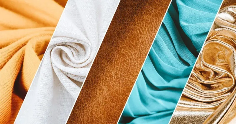
Photo: fashion flat lay mixing silk linen wool textures materials clothing editorial, via files.cdn.printful.com
Most discussions of personal style begin and end with two variables: color and silhouette. These are the visible coordinates by which outfits are typically constructed, and fashion media has reinforced their primacy for decades. Yet experienced designers and stylists consistently point to a third dimension—one that operates below the level of conscious analysis but shapes every impression an outfit makes—as the true differentiator between clothing that looks assembled and clothing that looks considered.
That dimension is texture. And its relative absence from mainstream style conversation is, frankly, one of the more curious oversights in contemporary fashion guidance.
Why Texture Registers Before Color Does
Human perception processes surface quality almost instantaneously. Before the eye fully resolves a color or deciphers a silhouette, it reads the material world in terms of light absorption and reflection—the matte density of a brushed wool, the subtle luminosity of a washed silk, the crisp geometry of a starched cotton. These readings happen faster than conscious thought, which is precisely why texture carries such disproportionate communicative weight.
In practical terms, this means that two outfits built on identical silhouettes and color palettes can read entirely differently based on the materials involved. A navy blue ensemble constructed in matte jersey and a navy blue ensemble constructed in a fluid silk charmeuse occupy entirely different aesthetic registers, despite sharing every other variable. One reads as casual and athletic. The other reads as quietly formal, even luxurious.
For the design-conscious dresser, understanding this principle unlocks a new layer of stylistic control—one that does not require purchasing new pieces, but rather rethinking the relationships between the pieces already at hand.
The Vocabulary of Material Contrast
Texture-forward dressing is fundamentally about contrast: placing materials in proximity so that each one amplifies the qualities of the other. This is not a new concept—interior designers have employed it for decades, layering nubby bouclé against smooth lacquer, rough linen against polished stone—but its application to personal style remains underexplored.
The most productive material contrasts tend to fall into a few recurring categories.
Matte against sheen. This is perhaps the most accessible entry point into texture mixing. A matte wool trouser paired with a silk or satin blouse creates an immediate visual dialogue, the light-absorbing quality of the wool making the reflective surface of the silk appear more luminous by comparison. The pairing is inherently sophisticated, and it works across virtually every color story.
Structure against fluidity. A tailored, stiff-shouldered blazer worn over a softly draped camisole or a loose linen shirt creates a tension that reads as intentional rather than accidental. The structure provides architecture; the fluid element provides movement. Together, they suggest a dressing intelligence that neither piece communicates alone.
Rough against refined. Raw-edged denim alongside a fine-gauge merino, or a chunky hand-knit sweater over a crisp poplin collar, plays with the cultural associations embedded in different materials. The contrast is not merely visual—it is conceptual, suggesting a wearer comfortable enough in their own aesthetic to hold apparent contradictions in productive tension.
Practical Pairings for Everyday Outfits
Abstract principle is only as useful as its practical application, so consider how these contrasts might manifest in a working professional's actual wardrobe.
A tailored linen blazer in a natural, slightly nubby weave, worn over a silk tank and paired with smooth leather trousers, layers three entirely different material stories into a single outfit. The linen reads as relaxed and textural; the silk introduces a note of refinement; the leather grounds the combination with a structured, polished weight. Each material is doing specific work, and the result is an outfit that holds visual interest without relying on pattern or bold color.
Alternatively, consider the elevated casual register: a fine-gauge ribbed turtleneck in a muted camel, worn beneath an oversized shearling-collared coat, with slim wool trousers and suede loafers. The ribbed knit, the shearling, the woven wool, and the suede represent four distinct surface qualities, each with its own light-reflective behavior. The palette is nearly monochromatic—but the outfit reads as anything but flat.
These are not complicated combinations. They require no particular investment in new wardrobe pieces. They require only a shift in the framework through which existing pieces are evaluated and combined.
Sourcing Quality Textiles Across Price Points
One of the more persistent myths surrounding texture-forward dressing is that it demands access to luxury price points. In practice, the most important variable is not the cost of a fabric but the integrity of its construction—a characteristic that can be assessed through touch and observation rather than price tag.
At accessible price points, brands such as Quince and Everlane have made genuine strides in offering natural fiber basics—linen, cotton, merino—at prices that make building a texture-diverse wardrobe achievable for a broad range of budgets. At the mid-market level, retailers including J.Crew, Banana Republic, and Club Monaco periodically offer well-constructed pieces in interesting material combinations worth seeking out, particularly during end-of-season sales.
For those with access to a budget that supports investment-level purchasing, heritage American brands and European mills represented at stores like Saks Fifth Avenue or Nordstrom offer textiles whose surface quality is immediately legible—cashmere with genuine depth, silk with proper weight and drape, wool with a hand-feel that communicates craftsmanship without announcement.
Regardless of price point, the practical test is consistent: hold the fabric to a natural light source and observe how it responds. Does it absorb light or reflect it? Does it fall with weight or float without structure? These are the qualities that determine how a material will read in context—and they are perceptible to anyone willing to slow down long enough to look.
Developing a Texture Sensibility Over Time
Like any design skill, sensitivity to texture is cultivated rather than innate. The most effective way to accelerate that development is through deliberate observation: noticing, in the outfits of others and in the pages of design-forward publications, which material combinations produce the most compelling visual results and attempting to reverse-engineer the logic behind them.
Museum collections offer a particularly rich resource. The costume and textile departments of institutions such as the Metropolitan Museum of Art in New York or the Los Angeles County Museum of Art contain historical garments whose construction reveals how skilled designers have always used material contrast as a primary expressive tool—long before color theory or silhouette analysis entered the popular vocabulary.
Style, at its most resolved, is always a conversation between elements. Texture is the element that has been waiting, quietly, for its turn to speak.