From Runway to Reality: A Designer's Playbook for Translating Fashion Inspiration Into Wearable Style
Every season, the fashion world delivers a new wave of imagery — architectural silhouettes on Paris runways, moody editorial spreads in glossy magazines, impossibly composed flat-lays on curated social feeds. For those with a trained eye for design, these images are genuinely inspiring. They communicate something about proportion, color, texture, and mood that transcends any individual garment. And yet, for most people, they also inspire a particular kind of frustration: the aesthetic is clear, the execution is elusive.
The gap between runway inspiration and a real-world wardrobe is not primarily a budget problem. It is a translation problem. Professional stylists are, at their core, translators — individuals trained to extract the essential visual logic of a look and reconstruct it using different materials, price points, and practical constraints. Their methods are learnable. And once understood, they fundamentally change how a design-conscious person engages with fashion inspiration.
Read the Concept, Not the Clothes
The first and most important shift in approach is learning to look past the specific garments in any editorial or runway image and identify the underlying concept. Designers do not simply present clothing — they present a proposition about proportion, mood, color relationship, and cultural reference. The clothes are the medium. The concept is the message.
Consider a runway look built around an oversized, structured coat in a deep charcoal, worn over a fluid silk midi skirt and minimal pointed-toe mules. The specific pieces may be far outside a practical budget. But the concept — the tension between rigidity and fluidity, the palette built around a single dominant neutral, the deliberate contrast of volume at the top and elongation at the bottom — is entirely reproducible at any price point.
Training yourself to articulate the concept behind an inspiring image before identifying individual pieces is the foundational skill of successful fashion translation. Spend time with images you admire. Ask: what is the proportion story here? What does the color palette communicate? What is the relationship between structured and unstructured elements? Once you can answer those questions, you are no longer shopping for specific items — you are shopping for specific principles.
Proportion Is the Architecture
Of all the tools in a stylist's kit, proportion is the most powerful and the least discussed in mainstream fashion conversation. Every successful look is, at its core, a proportion equation. The relationship between fitted and oversized, between cropped and elongated, between volume at the shoulder and volume at the hip — these decisions determine the visual impact of an outfit far more than any individual piece.
High fashion frequently plays with proportion in exaggerated ways: extreme volume, unconventional hemlines, silhouettes that deliberately subvert expectation. Translating these looks for everyday wear does not require replicating the extremes. It requires understanding the underlying ratio and applying a more moderate version of it.
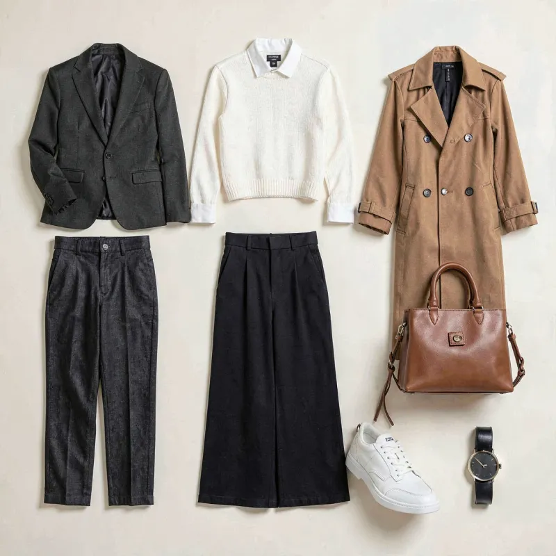
A runway look featuring a dramatically oversized blazer worn with narrow, ankle-length trousers communicates a specific proportion logic: volume above, precision below. That logic can be translated into a relaxed-fit linen blazer from a mid-market retailer worn with tailored slim pants, and the essential visual intelligence of the original look is preserved.
Color Blocking With Intention
Editorial color stories are among the most immediately striking elements of fashion imagery, and also among the most approachable for real-world translation. Color blocking — the practice of pairing distinct, often contrasting color areas within a single outfit — is a technique that reads as sophisticated when executed with intention and jarring when applied without a clear logic.
The key principle stylists apply is tonal relationship. High-contrast color combinations, such as cobalt and burnt orange or forest green and burgundy, require a unifying element — typically a shared undertone, a consistent saturation level, or a neutral that bridges the two. Without that unifying thread, the combination reads as accidental rather than considered.
For those beginning to incorporate intentional color blocking into their wardrobes, a practical starting point is working within a single tonal family — pairing shades of the same color at different saturations — before moving toward contrasting combinations. Monochromatic dressing, a staple of editorial styling, is simultaneously one of the easiest techniques to execute and one of the most visually impactful.
Layering as Visual Complexity
Layering is the technique most frequently responsible for the gap between an editorial look and its real-world imitation. When done well, layering adds visual depth, textural interest, and a sense of considered assembly that elevates even simple individual pieces. When done poorly, it reads as bulky, confused, or unintentional.
Professional stylists approach layering as a conversation between garments. Each layer must contribute something distinct — a different texture, a different weight, a different structural quality — while maintaining the overall coherence of the look. A fine-knit turtleneck beneath an open-weave jacket, worn over a lightweight dress, creates three distinct textural registers that read as intentional rather than haphazard because each contributes a different quality.
Length relationships between layers are equally important. Allowing a longer piece to deliberately extend below a shorter one — a shirt hem visible beneath a cropped knit, for instance — creates visual interest through contrast. The key word is deliberately: the length differential should appear chosen, not accidental.
The Accessible Brand Strategy
Translating high fashion inspiration does not require purchasing high fashion. It requires understanding which elements of a look are doing the most visual work and investing most deliberately in those specific elements, while sourcing supporting pieces more economically.
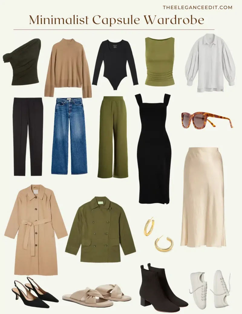
In most looks, one or two pieces carry the primary aesthetic weight — the statement coat, the architectural shoe, the precisely cut trouser. These are the pieces worth investing in at a higher price point, because they define the silhouette and set the tone for everything around them. Supporting pieces — the layering basics, the simple knits, the foundational wardrobe items — can be sourced from accessible brands without diminishing the overall effect.
US retailers including Everlane, Banana Republic, and J.Crew Factory consistently offer pieces with clean lines and quality construction at accessible price points. Thrift and consignment markets, particularly those in urban centers, frequently yield high-quality investment pieces at significant discounts. The strategy is not to avoid spending — it is to spend with the precision of a trained eye rather than the enthusiasm of an impulse.
Accessories as Punctuation
In editorial styling, accessories are rarely decorative additions. They are punctuation marks — elements that clarify, emphasize, or redirect the meaning of the surrounding look. A single well-chosen accessory can elevate a simple outfit into something that reads as genuinely considered. Conversely, an excess of accessories tends to dilute the visual statement of even a beautifully assembled look.
The editorial principle most worth borrowing is the idea of one strong accessory per look. A sculptural earring. A precisely proportioned belt. A bag in an unexpected texture. One element that draws the eye and signals intention. The rest of the look supports that choice rather than competing with it.
Building the Translation Practice
Fashion translation, like any design skill, develops through consistent practice. Maintaining an inspiration archive — a curated collection of images that resonate aesthetically — and returning to it regularly with analytical eyes builds the visual vocabulary necessary for confident real-world application.
Over time, patterns emerge. Certain silhouettes recur. Specific color relationships appear repeatedly. Proportional preferences clarify. What began as scattered admiration for individual images coheres into a recognizable personal aesthetic — one informed by the best of high fashion inspiration and grounded in the practical reality of an actual life.
The runway will always be a world apart. But its language is learnable, and its ideas are more portable than they appear.